The Most Widely Used Technical Indicator In The World & Why It Matters So Much!
While there are a number of technical indicators that are useful to me and have their own strengths, (which tell me what is likely to happen concerning a stock, ETF or index)…if you told me I could only have ONE technical indicator, this would be it: the 200-period simple moving average
https://www.investopedia.com/terms/s/sma.asp
Why? It’s the most widely watched and used indicator in all of technical analysis. Yet there are several things that this one indicator tells us, all at the same time.
The main way that people know to use this moving average is to simply detect the long-term trend direction. While prices will gyrate up and down, the moving average “smooths out” this activity and it helps you to better see if prices are trending higher or lower overall. The good news is that you don’t have to be a skilled technician/chartist, like you would to have to draw trend lines properly.
No, this moving average is automatically calculated on the chart for you. On a daily chart, the formula adds up the last 200 days of activity and divides them by 200 and plots a dot. Each day, the oldest point is dropped off and the newest data point is added and the formula recalculates the data and draws a new point. These dots are all pushed together to form a trending line. This tells us which way the stock, ETF or index is trending overall.
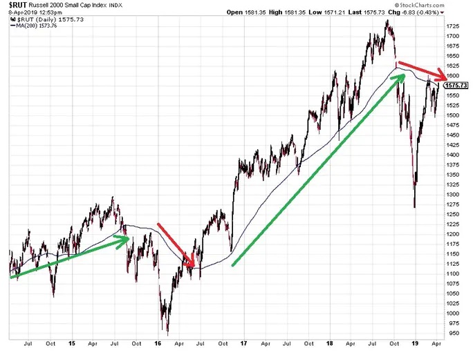
For instance, in the chart of the Russell 2000 small cap index (an index of smaller public companies)…over the last five years, we can see that the main, long-term trend only changed a few times. So this indicator allows you to take advantage of long moves and you don’t have to sit in front of your computer each day and be a “screen jockey”.
When the blue moving average line is trending higher, prices are rising overall and the trend is “up”. When the moving average tilts downward (red arrows emphasize this), then the trend of the index is heading lower overall.
This is the main way in which most people know how to use this indicator. However, there are SO many other things we can derive from this one moving average other than just the trend’s overall direction.
For instance, we can gauge the sentiment of the masses by knowing if their making money or losing money, overall. After all, the 200-day moving average looks at the last 10 months of trading activity and the moving average shows where those people have bought-and-held on average, in the stock, ETF or index, etc.
When the price is trading fairly consistently above the rising moving average, then investors are mainly making money overall and investor sentiment is positive.

However, when the asset drops notably below this long-term moving average, then we know that a ton of people are now “in the red” and at least temporarily losing money overall. This causes the sentiment among investors to turn negative and they’re MUCH quicker to be emotionally-led investors and apt to hit the “sell button”. This can cause huge sell-offs in the asset (emphasized by the red arrows above). So, knowing the sentiment of the masses and whether they’re up or down overall on their investment is helpful to know because investors act differently depending on whether they’re making money (and confident in the stock, ETF or index that they’re invested in) or their confidence got zapped as the majority of them are all of the sudden losing money and apt to collectively hit the sell button and cause a massive, overall sell-off in the asset.
Another thing we can gain from watching the relation between the asset’s price and it’s moving average is that we can see huge potential risks AHEAD of time and dodge big down-drafts in the asset being charted.
For instance, any time the price of the asset moves unusually far above its moving average (relative to what it’s done historically on average), then it shows that investors are overly-bullish on the asset at the time and they’re buying it up too aggressively and much of the time, there will be a huge sell-off that follows that can be dodged, simply by noting these wide distances between the price and the moving average (emphasized by the red arrows below).

Additionally, (as long as the asset itself is fundamentally solid), when the asset trades unusually far below its 200-period moving average, it shows that investors have become extremely pessimistic…likely unjustifiably pessimistic and there could be value to be had in the asset. The green arrows show these periods for the Russell 2000 index above. It’s not a “guarantee” that the asset is overdone and is destined to bounce back higher, but it certainly points out the extreme pessimism and you can look at fundamental metrics (price-to-earnings ratios, etc.) to see if the asset at hand has gotten fundamentally cheap (and make sure the asset is fundamentally solid as well).
Another thing the 200-period moving average does is gives us targeted areas in which the price is likely to (at least) fall to, when the price has gotten historically stretched away (too far above) its 200-week moving average, as emphasized by the red arrows below.

It doesn’t mean the price has to reach or surpass the moving average but many times it will. And we know that, at a minimum, there’s a HUGE chance that much of the gap closes between the price and the moving average. So this isn’t an indication to short-sell. I don’t encourage that.
But if you’d been in the asset (as a buyer/long) and the price had gotten very far extended away/above the 200-week moving average, then you’d know that there is a HUGE chance that the asset falls notably in the future. You’d know this AHEAD of the fall and could take profits and dodge the coming down-draft.
By assessing the distance between the asset’s price and the 200-day and/or the 200-week moving averages, it helps us to keep our heads about us and assess and notice unusual risks when they present themselves. Why is this important? How do you think the news headlines read when the price is soaring far away/above its major moving averages? The news is super-positive and it would cause you not to see these potential risks at all.
And the same thing goes for when a stock trades notably below its major moving averages. The news headlines will be extremely pessimistic. However, IF the asset is BOTH fundamentally solid AND fundamentally cheap, then it may be worth considering investing in the stock.
One final thought on the 200-period moving average (whether on daily or weekly charts)...the moving average acts like an automatically calculated zone/region of support or resistance for the stock. When the stock is below the declining moving average, it “bumps its head” up on the moving average and acts as a zone of resistance.
However, when the price of the stock above the moving average and the moving average is also rising, then the moving average acts like a zone of support for the stock (where the decline is likely to halt and reverse upward). So you don’t have to worry about trend lines and drawing them or if you’ve drawn them correctly. No, the moving average takes care of all of that for you automatically.
If you want to know even more techniques that give you a long-term edge in your investing, then consider joining the Logical Investor newsletter where you’ll get exact buy and sell recommendations on stocks that are held for an AVERAGE of 2-4 years (true investing, not trading).
God bless!


Leave A Comment
You must be logged in to post a comment.